Basic Colors
The Basic Colors card sets the main colors of the Share Button and Share Pop-Up in one place. Each basic color updates several elements at once, so it is the quickest way to match Share Cart to your store.
This page shows you where to find Basic Colors, what each color changes, and how to save.
How to Change the Basic Colors#
Step 1: In your Shopify admin, under Apps, click Bevy Share Cart - Social Link. The app opens on its Dashboard.
Step 2: In the settings list, click Design. The section opens with a back arrow next to its name.
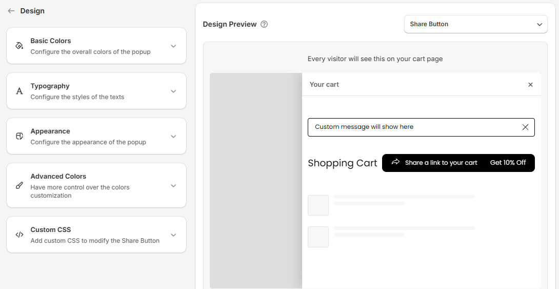
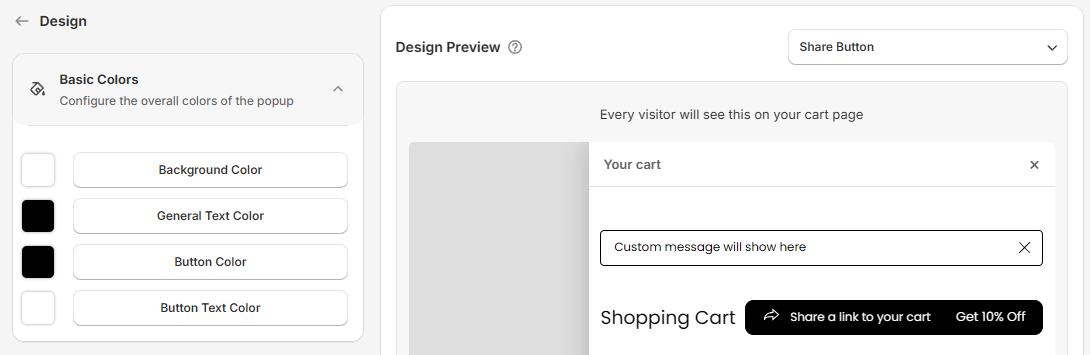
Step 3: Click the Basic Colors card to expand it. You see four color buttons, each with a swatch of the current color.
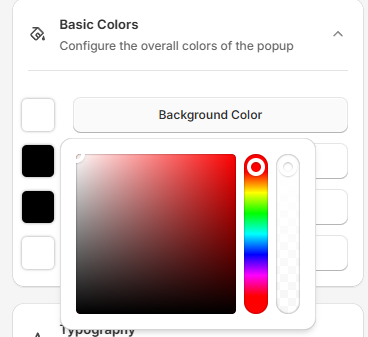
Step 4: Click a color button to open the color picker. Drag in the color area to pick a shade, use the hue slider to change the color, and use the transparency slider to make it see-through. The Design Preview updates as you go.
Step 5: Click Save in the save bar at the top of the page. Your changes are not live on your store until you save. To undo unsaved changes, click Discard.
Basic Colors Settings#
| Setting | What it changes | Also updates these Advanced Colors | Default |
|---|---|---|---|
| Background Color | The background of the Share Pop-Up | Modal Background | White |
| General Text Color | The title on the cart and the text in the Share Pop-Up | Share Title, Modal Text, Footnote Text Color | Black |
| Button Color | The Share Button and the buttons in the Share Pop-Up | Share Button, Copy Button, Toggle Button | Black |
| Button Text Color | The text and icons on all buttons | Share Button Text, Share Icon, Copy Text, Copy Icon, Toggle Icon | White |
Note: Changing a basic color overwrites the matching Advanced Colors. Set your basic colors first, then fine-tune single elements in Advanced Colors.
If you want a ready-made color scheme instead, click Pick a theme at the top of the Dashboard. See Themes.
For any kind of help, feel free to reach out to us via live chat or email support@bevycommerce.com.