Custom CSS
Share Cart’s Custom CSS feature lets us customize the Share Button and Pop-Up by adding Custom CSS based on our preference. This feature comes in handy when we don’t want to modify the Share Button and Pop-Up elements manually.
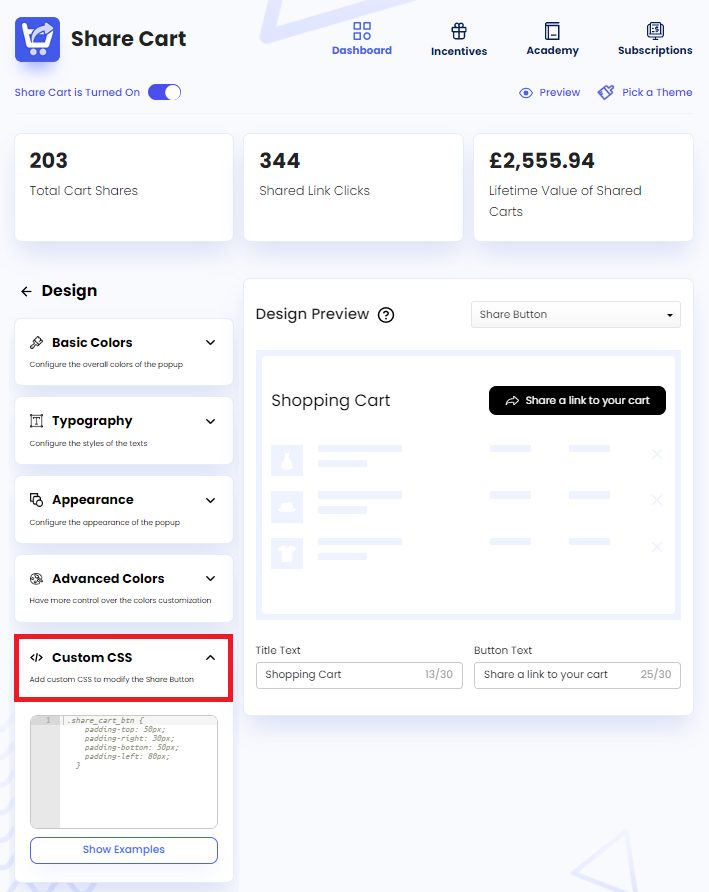
To access this feature, we have to visit the Share Cart Dashboard, go to Design > Custom CSS, and click on the drop-down to expand the section.
Adding Custom CSS to Share Button
The steps for adding Custom CSS to Share Button are as follows:
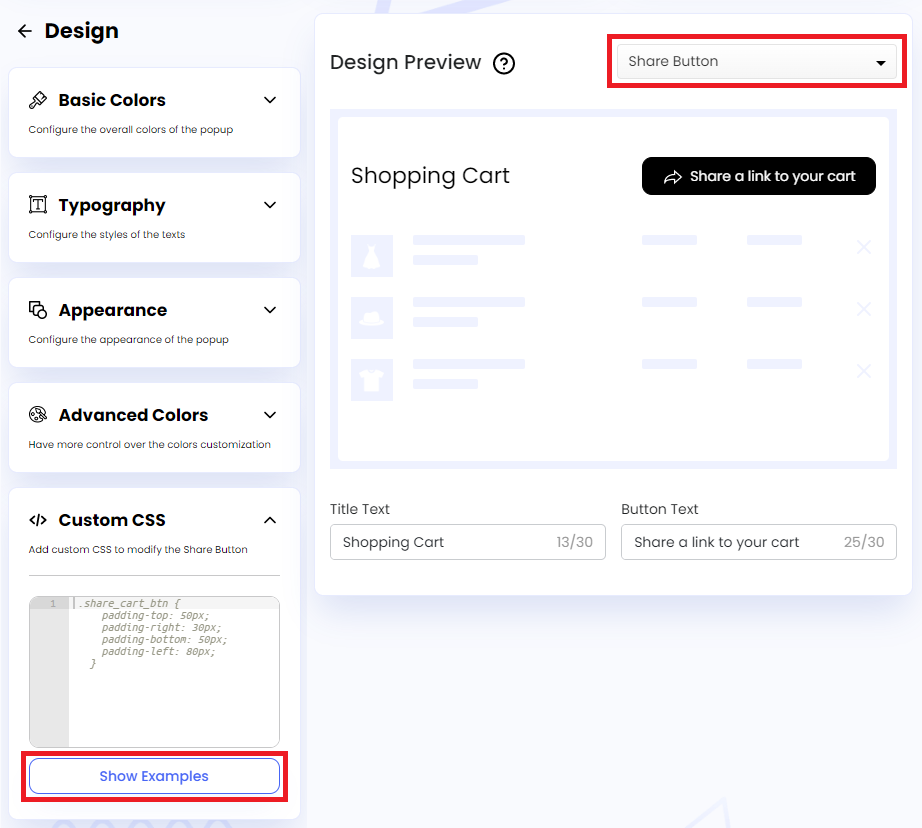
Step 1: We have to select Share Button from the Design Preview dropdown and click on Show Examples button under Custom CSS.
Note:
Once the Show Examples button is clicked, the button text changes to Hide Examples.
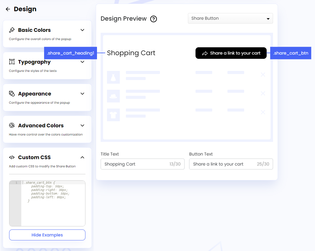
Step 2: This will show the following CSS selectors in the Design Preview section:
- Share Button:
.share_cart_btn - Share Title:
.share_cart_heading1
We have to use these selectors to target the classes for customizing specific elements of the button.
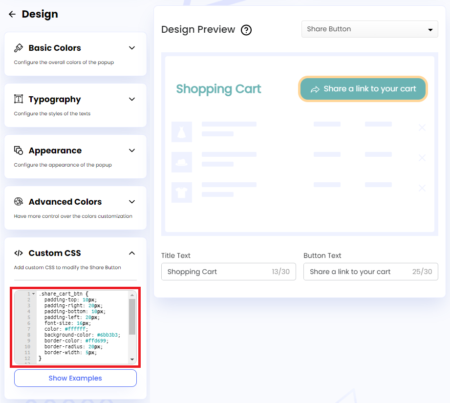
Step 3: In the embedded code editor, we have to add the CSS properties and their corresponding values for each selector to customize the Share Button. Examples are given below:
CSS for Share Button:
.share_cart_btn {
  padding-top: 10px;
  padding-right: 20px;
  padding-bottom: 10px;
  padding-left: 20px;
  font-size: 16px;
  color: #ffffff;
  background-color: #6bb3b3;
  border-color: #ffd699;
  border-radius: 20px;
  border-width: 5px;
}
CSS for Share Title:
.share_cart_heading1{
  color: #6bb3b3;
  font-size: 24px;
  font-weight: 700;
  padding: 10px;
}
Adding Custom CSS to Share Pop-Up
The steps for adding Custom CSS to Share Pop-Up are as follows:
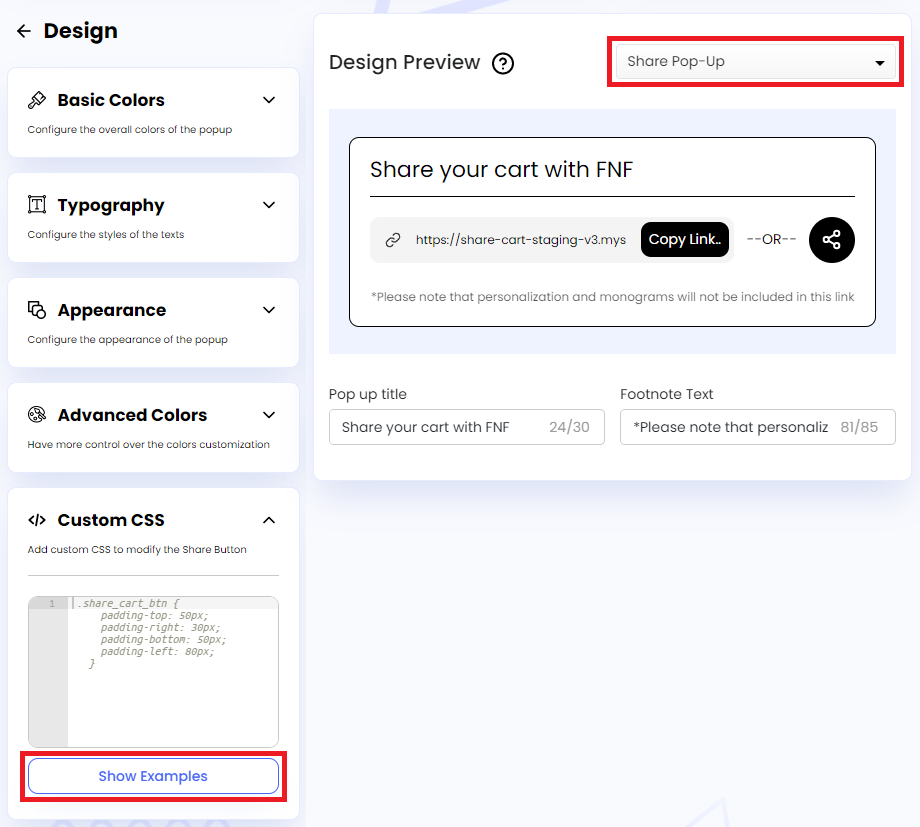
Step 1: We have to select Share Pop-Up from the Design Preview dropdown and click on Show Examples button under Custom CSS.
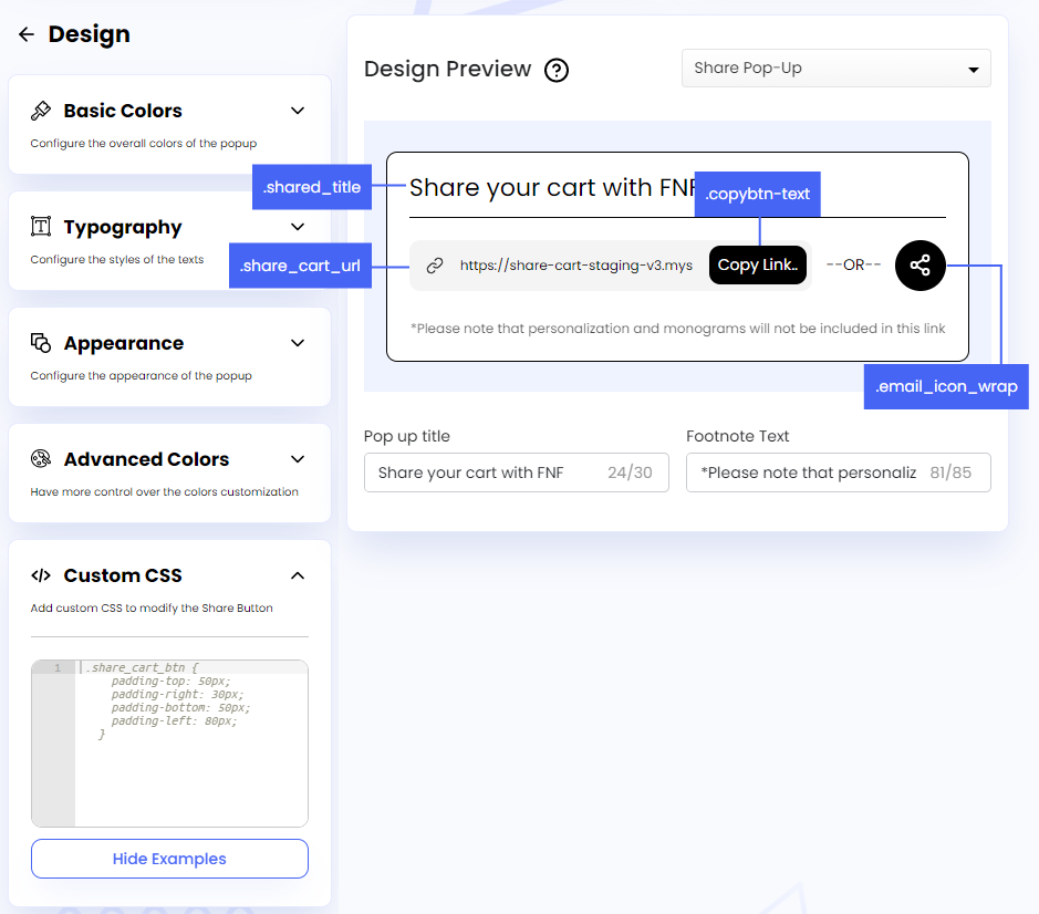
Step 2: This will show the following CSS selectors in the Design Preview section:
- Share Title:
.shared_title - Cart URL:
.share_cart_url - Copy Button Text:
.copybtn-text - Toggle Button:
.email_icon_wrap
We have to use these selectors to target the classes for customizing specific elements of the pop-up.
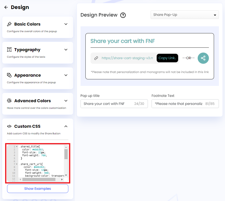
Step 3: In the embedded code editor, we have to add the CSS properties and their corresponding values for each selector to customize the Share Pop-Up. Examples are given below:
CSS for Share Title:
.shared_title{
  color: #6bb3b3;
  font-size: 22px;
  font-weight: 700;
 }
CSS for Cart URL:
.share_cart_url{
   color: #6bb3b3;
    font-size: 13px;
    font-weight: 400;
    background-color: transparent;
}
CSS for Copy Button Text:
.copybtn-text{
 color: #6bb3b3;
 font-size: 14px;
 font-weight: 400;
}
CSS for Toggle Button:
.email_icon_wrap{
    background: #6bb3b3;
    justify-content: center;
    width: 46px;
    height: 46px;
    border-radius: 100px;
}
We hope you make the most of Share Cart’s Custom CSS feature and modify the Share Button and Pop-Up to match your storefront perfectly.
If you have any questions or need assistance, reach out to support via live chat or email support@bevycommerce.com. We’re always happy to help!
