Appearance
The Appearance card controls the shape and layout of the Share Button and Share Pop-Up: the button icon, where the button sits, its height, how rounded the corners are, and how the title and button line up.
This page shows you where to find Appearance and what each setting changes.
How to Change the Appearance#
Step 1: In your Shopify admin, under Apps, click Bevy Share Cart - Social Link. The app opens on its Dashboard.
Step 2: In the settings list, click Design.
Step 3: Click the Appearance card to expand it.
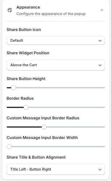
Step 4: Make your changes. The Design Preview updates as you go.
Step 5: Click Save in the save bar at the top of the page. Your changes are not live on your store until you save. To undo unsaved changes, click Discard.
Appearance Settings#
| Setting | What it changes | Options | Default |
|---|---|---|---|
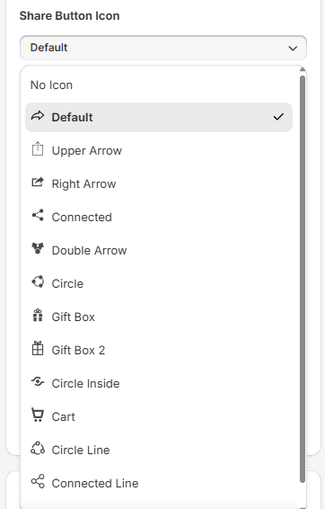
| Share Button Icon | The icon on the Share Button | No Icon, Default, Upper Arrow, Right Arrow, Connected, Double Arrow, Circle, Gift Box, Gift Box 2, Circle Inside, Cart, Circle Line, Connected Line, Right Arrow 2 | Default |
| Share Widget Position | Whether the Share Button and title sit above or below the cart | Above the Cart, Below the Cart | Above the Cart |
| Share Button Height | The height of the Share Button | Slider, 35 to 100 | 38 |
| Border Radius | How rounded the corners are. This applies to the Share Button, the Share Pop-Up and their other elements. | Slider, 1 to 50 | 10 |
| Share Title & Button Alignment | How the title and the Share Button line up | Title Left - Button Right, Button Left - Title Right, Both Center, Both Left, Both Right | Title Left - Button Right |
Choose No Icon to show the Share Button without an icon. The icon list shows each icon next to its name.
Note: Sliders show their value while you drag. Check the result in the Design Preview.
Settings That Appear When Share Message Is On#
When Share Message is on, two more sliders appear. They style the message input that shoppers use in the Share Pop-Up, not the message box on the cart.
| Setting | What it changes | Options | Default |
|---|---|---|---|
| Custom Message Input Border Radius | How rounded the corners of the message input are | Slider, 1 to 25 | 10 |
| Custom Message Input Border Width | How thick the border of the message input is | Slider, 1 to 6 | 1 |
If you have any questions, contact us via live chat or email at support@bevycommerce.com.